This Place Is Far Too Underused. New Hotel I'm Working On.
Started by
woofenskid
, Feb 03 2008 12:31 AM
6 replies to this topic
#1
Posted 03 February 2008 - 12:31 AM
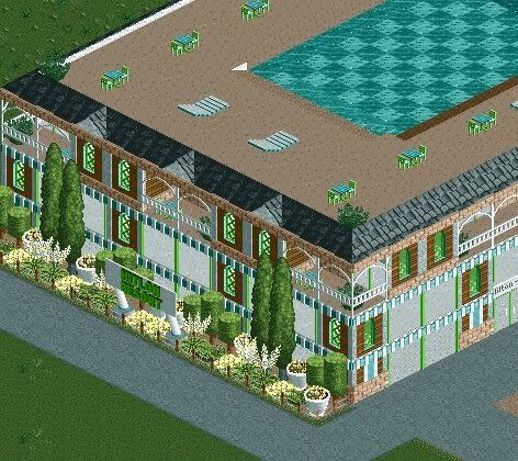
Just a start. It's not the best, I know.
#2
Posted 03 February 2008 - 01:04 AM
I love the color scheme and details, but I hope this is just 1 small wing of a much larger structure...
#3
Posted 03 February 2008 - 02:30 AM
tis but a single wing.
#4
Posted 03 February 2008 - 10:11 AM
are those white squares suppost to be large windows?
if so I sugest using real glass cause now it took me a while to figure if it went insed the building or just was a wall.
#5
Posted 03 February 2008 - 03:40 PM
are those white squares suppost to be large windows?
if so I sugest using real glass cause now it took me a while to figure if it went insed the building or just was a wall.
those are the real windows??
They're the large glass panes, I just put the fisherman wall around them to make the frames thicker.
#6
Posted 03 February 2008 - 09:09 PM
^ To me the glass panes now also look like walls....
I guess you coloured them white....? or made something in the background a colour that gives this effect.
Try playing around with the colour of the glass-panes: the light grey usually makes them completely transparant and looking very natural, some other colours, like a light blue, may also work well here....
The panes on the ground-floor can serve as doors, but if they are supposed to be that, then I think a vertical dividing bar in the middle will do well. The ones on the first floor I think would look more "window-like" if they do have a small horizontal panel or trim at the bottom site (otherwise those poor guests might feel so exposed....being visible from feet to head... as well as then they "cry" for some visible interior...)
Around the fine pool there now are tables- and chairs, and some "lounge-chairs".
But the scaling of those two types does clash...does not match at all. Now that scaling is really difficult in RCT, so fine if it is not always correct, but I would not place those things together in one spot then....that makes it so obvious. So use one type, or try to make one type bigger, or the other smaller....
I love the green and white ansd soft yellow, attractive combination for a hotel!
Emergo
#7
Posted 03 February 2008 - 09:23 PM
I like the colours used, they look nice, but it looks a little cold, so maybe add red or pink through foliage or detail. The rest looks good, although the roof doesn't look very inviting for a hotel. Maybe adding umbrellas, more potted plants, or mabe a swim up bar or something would liven it up.
Edited by jusmith, 03 February 2008 - 09:23 PM.
0 user(s) are reading this topic
0 members, 0 guests, 0 anonymous users