Well, I have good news everyone, for sure, we're are going to get some work done on this park, and hopefully be finished the midway soon! I finally reinstalled my RCT2 game, and it works perfectly now. A new update will be posted shortly.

Springbank Park
Started by
adamcolvin
, Mar 01 2007 08:05 PM
399 replies to this topic
#51

adamcolvin
-
- Members
-

- 778 posts
Park Owner
- Gender:Male
- Location:Ontario, Canada
- Interests:Aviation and other stuuf
Posted 13 June 2007 - 04:45 AM
#52
adamcolvin
-
- Members
-
- 778 posts
Park Owner
- Gender:Male
- Location:Ontario, Canada
- Interests:Aviation and other stuuf
Posted 20 June 2007 - 03:32 AM
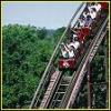
Just a quick picture of the starting of the midway.

I'm trying to work on my buildings, so bare with me here!
Thanks
I'm trying to work on my buildings, so bare with me here!
Thanks
#53
RNRMontuX
-

- Members
-
- 2986 posts
RCT Mart Moderator
- Gender:Male
- Location:Central Florida
Posted 20 June 2007 - 03:29 PM
Not bad at all. A little plain, but not bad.
#54
kagetachikoma
-

- Members
-
- 128 posts
Coaster Mechanic
- Gender:Male
- Location:Ohio
Posted 20 June 2007 - 04:55 PM
The image isn't working for me at all.
#55
RNRMontuX
-
- Members
-
- 2986 posts
RCT Mart Moderator
- Gender:Male
- Location:Central Florida
Posted 20 June 2007 - 07:03 PM
I can't see it either now.
#56
Spartan
-

- Members
-
- 50 posts
Park Cleaner
Posted 20 June 2007 - 09:43 PM
The image works for me.
your buidings look pretty plain, try and use some textures to make them more interesting. Also your folige almost looks like you randomly placed trees wherever.
your buidings look pretty plain, try and use some textures to make them more interesting. Also your folige almost looks like you randomly placed trees wherever.
Edited by Spartan, 20 June 2007 - 09:44 PM.
#57
adamcolvin
-
- Members
-
- 778 posts
Park Owner
- Gender:Male
- Location:Ontario, Canada
- Interests:Aviation and other stuuf
Posted 21 June 2007 - 12:27 AM
Firstly, a new picture of the back of the entrance with fountains. Also, I hope it doesn't look too tall now.

Well, after some touch-ups, I've completely revamped Midway Burgers.

Thanks for viewing, and I hope you like it!
Well, after some touch-ups, I've completely revamped Midway Burgers.
Thanks for viewing, and I hope you like it!
#58
lightkeeper
-

- Members
-
- 986 posts
Park Owner
Posted 21 June 2007 - 04:04 AM
The second building is on the right track, though the paint job needs a little work, give the window mullions a different color from the frames, and give the door frames a different color from the doors. plus, the Fisherman's arches don't work as black on there.
the first building has one major problem, you've only used the short (8 pixle) high wall, and it looks really bad, use the 1 unit high wall instead, it'll give you a much smoother flow texture wise. also, A giant blank wall creates a lot of weight, I certainly would hesitate before going under it. put in some windows to lighten it up.
the first building has one major problem, you've only used the short (8 pixle) high wall, and it looks really bad, use the 1 unit high wall instead, it'll give you a much smoother flow texture wise. also, A giant blank wall creates a lot of weight, I certainly would hesitate before going under it. put in some windows to lighten it up.
#59
Guest_K0NG_*
Guest_K0NG_*
-

- Guests
Posted 21 June 2007 - 04:56 AM
I pretty much agree with LK here....
The second building IS looking better.......but, IMO...the colors detract from what you've actually built there.
Try to use all three color variances in your windows.....IE: blue frames, maybe black on the mullions (which are the dividers between the window panes) and.....I usually use gold for the background in the windows (it seems to 'lighten' them up a bit).
Something that I've learned with structures......have at least ONE space below your windows and at least ONE space above them.....to add decor....and also......that way they don't look so "cramped" together between the 'floor/ground' level and the rooves.
Also...IMO...the colors you've chosen would look GREAT together on a race car...not so much on a building.
As for the 8 pixel wall parts....a lot of benches ONLY have them....so, break up the monotony of the wall by adding some detail...however you want....just don't get lazy and stick with full size layers (IE: the Ivies and such)...experiment a little and I'm sure you'll find something that will break up the monotony of the walls and ALSO add some elegance to an otherwise (no offense) boring wall.
Just my two cents.
#60
coastercrazy
-
- Moderator
-
- 1688 posts
2008 Valentines Contest RunnerUp
- Gender:Male
- Location:California
- Interests:RCT, duhh.:-P
Posted 21 June 2007 - 05:18 AM
Nice job adam. You guys will be seeing some stuff from me soon... 
/CC
/CC


0 user(s) are reading this topic
0 members, 0 guests, 0 anonymous users

