 This topic is locked
Edited by The Iron Dragon, 04 June 2007 - 11:29 PM.

Omega
Started by
RNRMontuX
, May 25 2007 11:18 PM
50 replies to this topic
#31

The Iron Dragon
-

- Members
-

- 1829 posts
I can't believe it's almost been six years.
- Gender:Male
- Location:Ohio
- Interests:None?
- Coaster Uploads:1
Posted 04 June 2007 - 11:28 PM
The buliding looks very nice, it's very cool that it goes over the water. The scenery around it fits it very well. The park looks very good so far. I can't wait to see the wooden coaster.
#32
RNRMontuX
-
- Members
-
- 2986 posts
RCT Mart Moderator
- Gender:Male
- Location:Central Florida
Posted 05 June 2007 - 02:05 AM
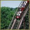
Thanks everyone. So as I promised, here are the screenshots of the woody and the double decker carousel.


#33
adamcolvin
-

- Members
-
- 778 posts
Park Owner
- Gender:Male
- Location:Ontario, Canada
- Interests:Aviation and other stuuf
Posted 05 June 2007 - 02:37 AM
Nice block. I'd say, fix up that carousal building and you'll be good.
#34
Coasterboy99999
-

- Members
-
- 45 posts
Park Cleaner
- Location:Edmonton, Alberta, Canada
- Interests:RCT2, NERF, Water guns.
Posted 05 June 2007 - 02:43 AM
Very nice work on the Woody, the station is eye pleasing and the coaster looks realistic, but the Double Decker Carousel could use some work. I think that it needs to be more.... open and a bit more colorful right now it seems almost depressing. Other that that GREAT job on the rest of the park.
#35
Trainman 2000
-

- Members
-
- 1465 posts
RCT Insanity Club Leader
- Gender:Male
- Location:Four-Dimensional Space-Time
- Coaster Uploads:40

Posted 05 June 2007 - 08:44 PM
The white space in between the rooves could be one quarter higher, but otherwise that building is good. The carousel... Well, It's been said.
#36
RNRMontuX
-
- Members
-
- 2986 posts
RCT Mart Moderator
- Gender:Male
- Location:Central Florida
Posted 06 June 2007 - 02:08 PM
Thanks.
Alright I'll fix the carousel. I'll try to make it more open.
Alright I'll fix the carousel. I'll try to make it more open.
#37
kagetachikoma
-

- Members
-
- 128 posts
Coaster Mechanic
- Gender:Male
- Location:Ohio
Posted 06 June 2007 - 03:56 PM
The woody looks really good as does the station, but the double decker carousel could use some work.
I have some suggestions for the double decker carousel.
First, you stacked them directly on top of each other and the top one apears to be floating. You want to make the top one higher and make a base for it. From that base you can create supports to the ground.
Secondly, it should feel more open. Using the poles would help achieve this.
Finally, although it's more of a personal thing, I would change the colors to match the carousel.
#38
coastercrazy
-
- Moderator
-
- 1688 posts
2008 Valentines Contest RunnerUp
- Gender:Male
- Location:California
- Interests:RCT, duhh.:-P
Posted 06 June 2007 - 10:13 PM
Very cool screen. I would change the color of thew trains though since they don't go very well with the surroundings.
Keep it up!
/CC
Keep it up!
/CC
#39
FK+coastermind
-

- Members
-
- 319 posts
2 times RR RunnerUp Winner Valentines Contest 2008
- Location:Illinois
- Interests:Roller Coasters ofcourse, And Half Life 2. I LOVE that game

Posted 07 June 2007 - 03:11 AM
your buildings look good but are still very blocky IMO. adding windows and doors helps but in order to decrease blockyness you should first look at your structure. try to eliminate large, on plane, walls by adding over hanges and balconies. also try seperating your windows and doors by adding details. layering is a great way to do this. try adding fences, arches, and deco pieces to the building to add more depth and texture. your building now have some detail but could use more, and lack structure greatly.
in this above screens the balcony fences look like anyone would easily fall off them. the foliage is very random and follows no sort of theme. try to set down a base set to use for different areas. also dont try to box off areas and fill them up. you could do soo much for that building but right now all of the bottom is covered by talls trees. try to space out your parks more!! its a good start!!
FK+Coastermind
#40
RNRMontuX
-
- Members
-
- 2986 posts
RCT Mart Moderator
- Gender:Male
- Location:Central Florida
Posted 11 June 2007 - 02:22 AM
Thanks for the comments. I fixed the carousel.


0 user(s) are reading this topic
0 members, 0 guests, 0 anonymous users

